Bliss comes in large scoops.
'Gelo Celo' is the ice cream sub-brand of the 'Estia bakery-confectionery' chain of shops in Thessaloniki. Aimed at the young audience, the redesign of Gelo Celo's identity and visual communication materials, add up in a bold, cheerful statement, with pop aesthetics and vivid colors.
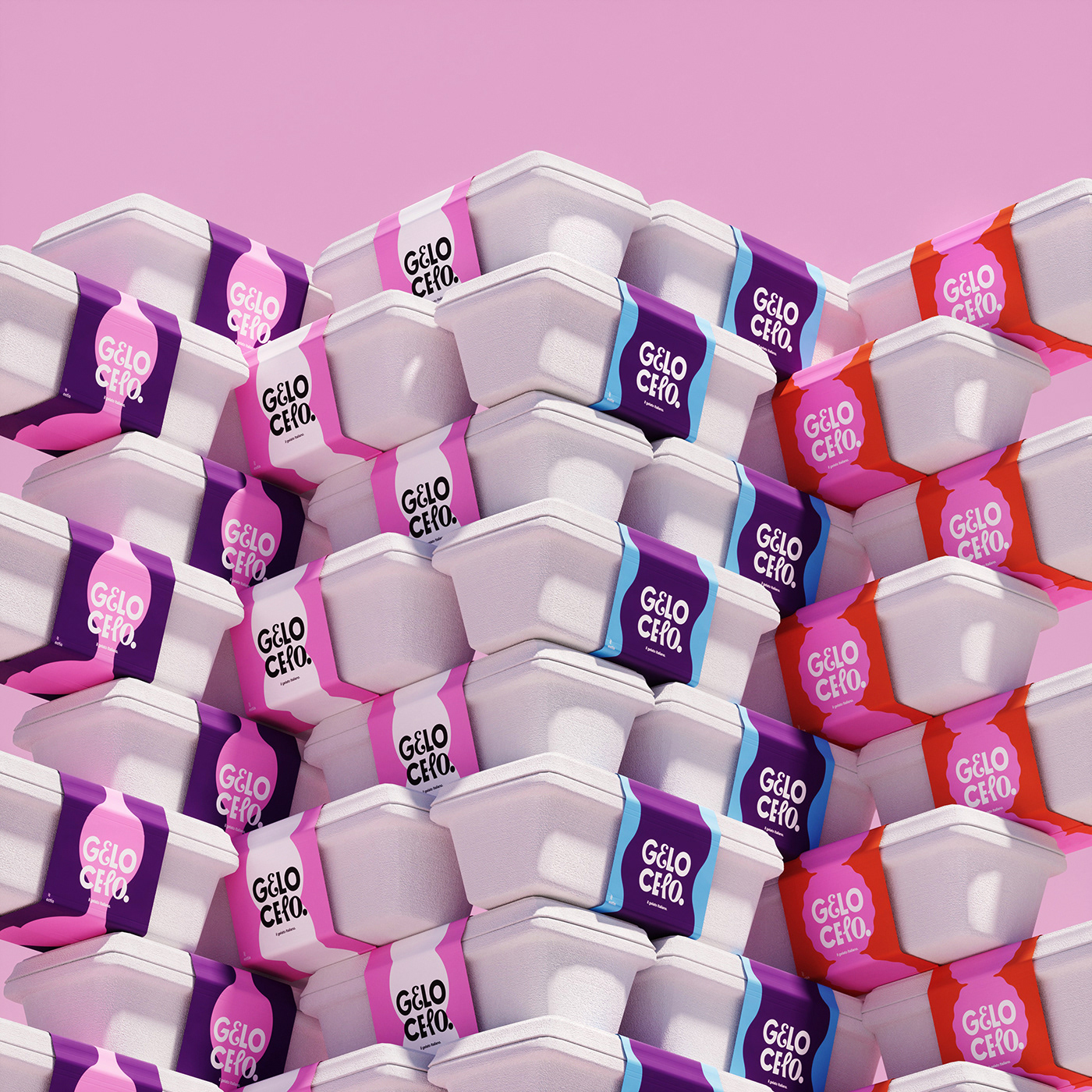
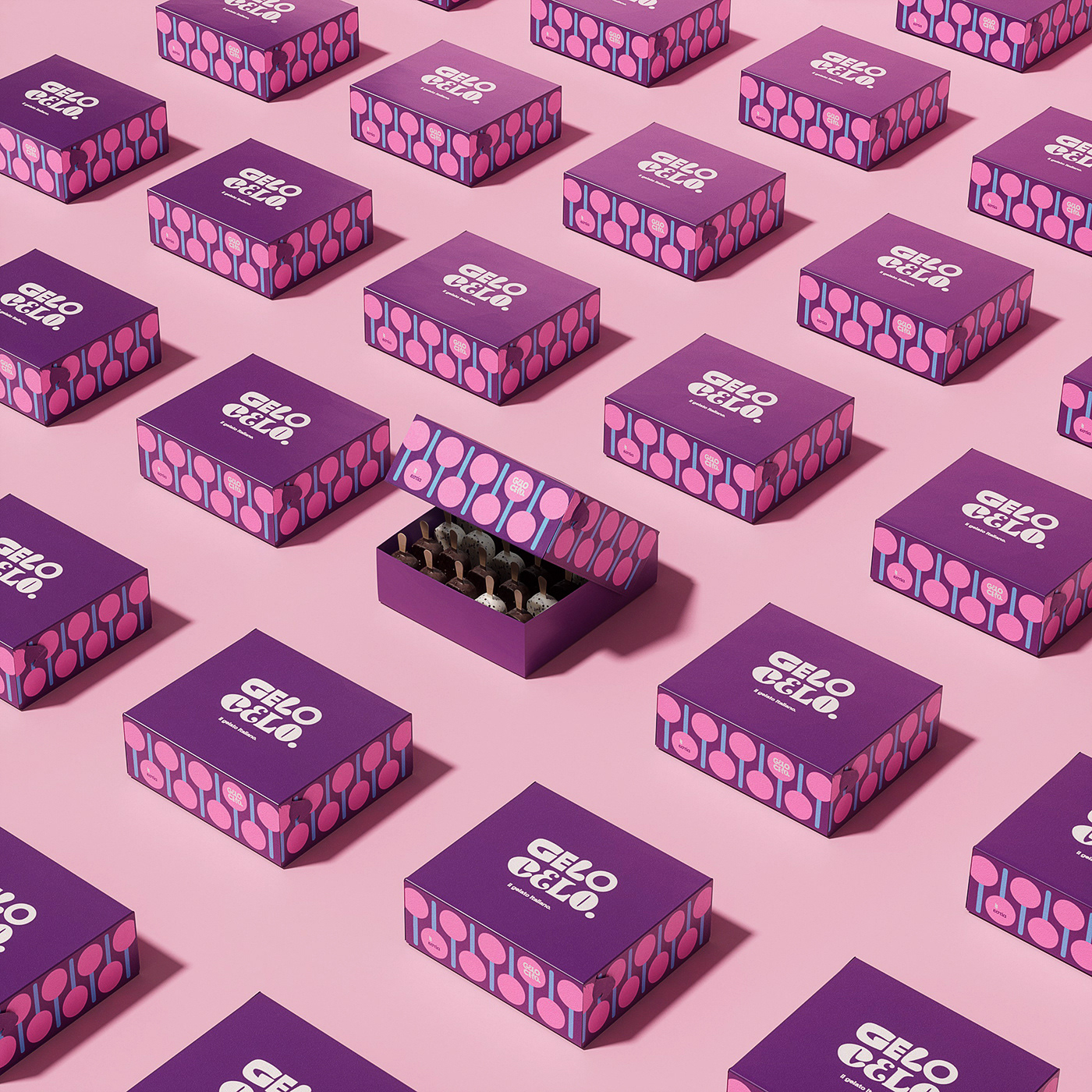
All people are different in character, but they all come together in their love for good ice cream. This notion formed the basis for the redesign of the 'Gelo Celo' logomark. Three different characters were drawn for each letter of the brand name. By combining these letters, a different set is born every time that makes up the logomark.
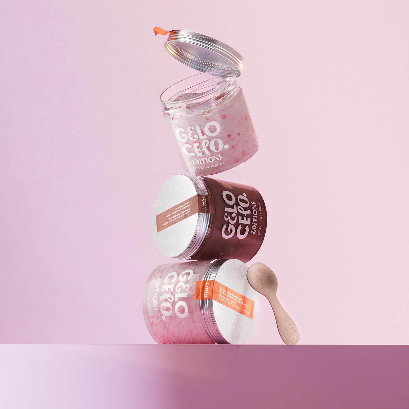
With this dynamic format of the 'Gelo Celo' logo in all signs, cups, labels and boxes, the central idea of diversity becomes more emphatic, while the brand keeps its overall look homogeneous and visually interesting. Just as ice cream forms shapes, volumes and curves when served, so the graphic elements of the brand, depict organic shapes and sculptural silhouettes - to mimic the familiar shapes of the ice cream scoops. Thus creating a background for all applications of printed communication. These shapes are colored with α vibrant and lively palette, just as the flavors and memories of all of us are intense, with our favorite ice cream. 'Gelo Celo' proves that we all have a - kinda secret- sweet tooth for ice cream.
Boo Republic® 2021